
Everyone has probably seen the Oscar gaffe by now, the first in its 88-year history. For those who don’t know what I am talking about, there was a mix-up during the declaration for Best Picture, resulting in La La Land being announced in the place of Moonlight. Aside from it being the unfortunate mistake of the person who handed out the winner card, I was also puzzled as to how the presenters didn’t realize that they were holding the card for the wrong category! This article solved that mystery. Getting the typography right – such a small thing – could have averted this mishap.
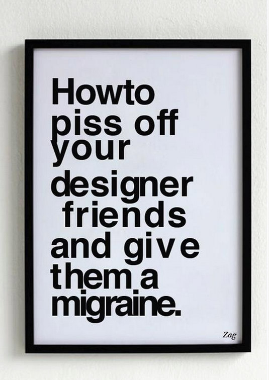
Typography is one of the many details that can seem small but makes a huge difference in presentation. The next time we are preparing something to be viewed by someone else – whether it is a resume, video or just a simple email – let’s put ourselves in the reader’s shoes, see what he/she will see and if the things of interest to him/her are displayed prominently and aestheically. Sometimes, especially if you have been staring at your own work for a long time, it helps to ask a friend to also take a look, for fresh eyes.
As the Oscar incident has shown us, attention to detail matters.
